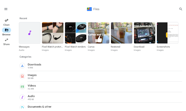
Hopefully, we will see more of Google's Android apps receive tablet optimizations.
With the introduction of Android 12L, Google has been focused on making better and more optimized apps for Android tablets and Chromebooks. I'm sure this has been in motion for some time but we are now starting to see the fruits of that labor. Earlier this year I noticed that the Google Podcast app received an update that better utilized the space with two rows instead of one podcast listing stretched across the screen.
Now we're seeing the same thing with the Files app. Google is now using a navigation rail on the left side. Similar to the Google Photos Android app. This makes navigating Files by Google much easier and more importantly, the app is utilizing the space effectively. Elements in the app is not stretched across the screen creating a more aesthetically pleasing app to look at on a large screen and that's the goal with Android 12L.
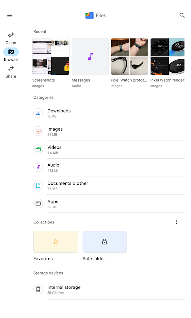
The tablet UI improvement can also be seen when the app is in portrait mode or turned vertically. Elements in the app are centered with the navigation rail still on the left.
For comparison, in the Files by Google app on an Android phone, the navbar is at the bottom. Makes sense for the form factor for sure.
I'm definitely digging the new look and want to see more of these updates in Google's own apps in the near future. The other benefit of Google taking larger screens seriously is that developers would have no choice but to get on board or risk being left behind. I see that as a win-win for us consumers.
What do you think? Let me know in the comments.


Comments
Post a Comment